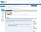
This NASA animation of the Five-Year Average Global Temperature Anomalies from 1881 to 2009 shows how temperature anomalies have varied in the last 130 years. The color-coded map displays a long-term progression of changing global surface temperatures from 1881 to 2009. Dark red indicates the greatest warming and dark blue indicates the greatest cooling.
- Subject:
- Applied Science
- Career and Technical Education
- Environmental Science
- Environmental Studies
- Physical Science
- Provider:
- CLEAN: Climate Literacy and Energy Awareness Network
- Provider Set:
- CLEAN: Climate Literacy and Energy Awareness Network
- Author:
- NASA/Goddard Space Flight Center Scientific Visualization Studio
- Date Added:
- 06/19/2012


