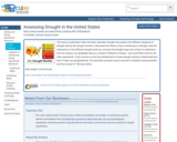
This easy-to-understand video animation describes drought and explains the different categories of drought used by the drought monitor. It discusses the effects of and contributions to drought, what the implications of the different drought levels are, and puts the drought maps into context to understand how the impacts vary geographically (e.g. drought in Nevada vs Kansas - one could affect tourism, the other agriculture). It also touches on how the development of maps/drought severity is determined and how it might vary geographically. The animation provides a basic overview of statistics and percentiles and the concept of '100 year events.'
- Subject:
- Agriculture
- Applied Science
- Atmospheric Science
- Career and Technical Education
- Economics
- Environmental Science
- Environmental Studies
- Physical Science
- Social Science
- Material Type:
- Diagram/Illustration
- Reading
- Provider:
- CLEAN: Climate Literacy and Energy Awareness Network
- Provider Set:
- CLEAN: Climate Literacy and Energy Awareness Network
- Author:
- CoCoRaHS
- Colorado Climate Center
- Date Added:
- 06/25/2019
