
Useful chart, and application of trinary 26 + 1 (zero, neutral)
- Subject:
- Information Science
- Material Type:
- Unit of Study
- Author:
- R M
- Date Added:
- 09/19/2023

Useful chart, and application of trinary 26 + 1 (zero, neutral)
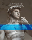
DISSENT BY DESIGN is a book that was produced during 2022-2023 in response to the Russian invasion of Ukraine on February 24, 2022. It was on this date that I began a social media campaign on LinkedIn that directly addressed the invasion of a Sovereign country by a rogue super power. As a Graphic Designer I felt it was my obligation to do all I can to bring attention to this atrocity and bring the narrative to the forefront of the conversation so that we help end this conflict in all theways we can. This book is a call to action, in the form of 'social media' posts throughout a one year period of time in our collective past, it is a documentation in chronological order of what happened, when and who was to blame and how many sufferred. FInally, this book illustrates how Graphic Designers can use their knowledge as storytellers to forward a conversation about the most important things in our lives and how to preserve them. We can be a vehicle of change and/or social engagement, to help people understand all the complex problems we face and to begin the process of solving those problems. This is a way forus to bring past narratives to light once again, to rejoin the conversations that have been lost, and to further discuss and provide solutions through dialogue and change.
Video on creating digital art using Photoshop

Short Description:
NewParaColour theory covers a long history from antiquity to modern times. It includes academic and scientific investigations into how we see and understand colour. It also includes practical applications for using colour in creative work.NewParaThis learning resource covers the history of colour theory, how we see colour, and how to use colour systems to mix colour and create colour relationships.NewParaAlso included in this resource are quizzes to test your knowledge, and practical learning activities to guide users in applications of colour theory for art and design. It's useful for anyone working with colour in creative and scientific fields.
Word Count: 51635
(Note: This resource's metadata has been created automatically by reformatting and/or combining the information that the author initially provided as part of a bulk import process.)
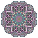
This google doc lesson includes a demonstration video of how to create a mandala in Photopea, a set of written instructions and an assignment that goes along with the video.

Reading and creating comic strips and comic books are engaging ways to promote literacy at any grade level and across content areas. The students in this video are members of a high school comic book club and have access to drawing tablets and Adobe Photoshop, so they can achieve sophisticated results. Even without such software, however, teachers can still integrate digital comics into a wide range of teaching situations.
There are a number of comic books, especially contemporary ones, that are not “school appropriate,” so you might want to guide students’ web research on comic books.
Google document outlining the steps for a cross curricular activity between a class studying Shakespeare (in my case it was Theatre) and an Art class (in my case it was Advanced Graphic Design). Students are tasked with designing a
t-shirt using a quote or image from Shakespeare and the school logo and name.
Step by step how to on creating digital illustrations in Photoshop
This book was written by two artist educators who teach digital art and design studio foundation classes. While teaching classes that take place in software laboratories, we noticed that many of our students expected to learn to use software, but gave little consideration to aesthetics or art and design history. A typical first day question is, "Are we going to learn Photoshop in this class?" This book is a mash-up of the Bauhaus Basic Course and open source software such as Inkscape, Gimp, Firefox, and Processing. We have taken some of the visual principles and exercises from the Bauhaus Basic Course and adapted them into exercises for these applications.

This class covers the history of 20th century art and design from the perspective of the technologist. Methods for visual analysis, oral critique, and digital expression are introduced. Class projects this term use the OLPC XO (One Laptop Per Child) laptop, Csound and Python software.
Short Description:
This textbook — written by a group of select experts with a focus on different aspects of the design process, from creation to production — addresses the many steps of creating and then producing physical, printed, or other imaged products that people interact with on a daily basis. It covers the concept that, while most modern graphic design is created on computers using design software, the ideas and concepts don’t stay on the computer. The ideas need to be completed in the computer software, then progress to an imaging (traditionally referred to as printing) process. Keywords are highlighted throughout and summarized in a Glossary at the end of the book, and each chapter includes exercises and suggested readings.
Long Description:
This textbook is written by a group of select experts with a focus on different aspects of the design process, from creation to production. Traditionally referred to as graphic design, communication design is the process by which messages and images are used to convey information to a targeted audience. It is within this spectrum that this textbook addresses the many steps of creating and then producing physical, printed, or other imaged products that people interact with on a daily basis. Design itself is only the first step. It is important when conceiving of a new design that the entire workflow through to production is taken into consideration. And while most modern graphic design is created on computers, using design software such as the Adobe suite of products, the ideas and concepts don’t stay on the computer. To create in-store signage, for instance, the ideas need to be completed in the computer software, then progress to an imaging (traditionally referred to as printing) process. This is a very wide-reaching and varied group of disciplines.
Each chapter begins with a list of Learning Objectives, and concludes with Exercises and a list of Suggested Readings on the Summary page. Throughout, key terms are noted in bold and listed again in a Glossary at the end of the book.
Word Count: 69165
ISBN: 978-1-989623-67-1
(Note: This resource's metadata has been created automatically by reformatting and/or combining the information that the author initially provided as part of a bulk import process.)

Digitally accessible, visually appealing courses
Short Description:
This book was written to help educators and instructional designers to design visually appealing courses (and curricular materials) that are also digitally accessible. I argue that applying graphic design principles reduces barriers, lowers cognitive load, and improves learning. I created the Graphic Design E-Learning Checklist to help instructional designers improve the look and feel of their courses while designing for inclusivity at the forefront.
Long Description:
In Graphic Design for Course Creators you will read about how to use and apply graphic design theory to improve the look, feel, and usability of your courses. You will also learn how to improve the digital accessibility of your courses while making strong design choices backed by learning science. For example, by learning the differences between images that aid in instruction and those considered seductive details, you will improve the learning experience of your students. Additionally, tips on selecting and combining colors will help you communicate appropriately while learning how to use color contrast will ensure more learners can access the materials created. Graphic Design for Course Creators contains checklists and questions to review for every chapter so that you can confidently make design choices your educational stakeholders will love.
Word Count: 56063
(Note: This resource's metadata has been created automatically by reformatting and/or combining the information that the author initially provided as part of a bulk import process.)

How to Canva: Tips and Tricks is an online introductory course on Canva. It is designed as open educational resources for educators and all. In this course, you will learn how to customise text, text effects, colours, photos, videos and elements plus pro tips and Ideas for Creative uses of Elements, Keywords and Styles. The videos are concise, purposeful and delivered in easy-to-follow lessons that progressively build one's skills over time. By the end of this course, you will be able to create an attractive Instagram post. Click on View Resource and let's get started!
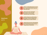
This resource was created for first time individuals who are looking to meditate. It also serves as an example of a job aide or infographic. This was created as a part of a larger course on meditation.
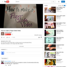
Looking for a powerful yet simple, low-tech way to integrate digital storytelling into your classroom? Then I’ve got an answer for you: Paper Slide Videos. Just like the name implies, this technique actually involves the sliding of papers to create a movie. Yep, without needing much time, effort and/or tech skills, a fabulous video can be produced. Here’s how:
Lesson plan for a project that can be used as an icebreaker or introduction to Adobe Photoshop. Students will use Photoshop and self images to illustrate a place or situation where they "would rather be."
Lesson plan for a project that can be used as an icebreaker or introduction to Adobe Photoshop. Students will use Photoshop and self images to illustrate a place or situation where they "would rather be."
Preliminary Research Exhibition
Short Description:
This exhibition presents the preliminary major research project ideas of OCAD University’s Inclusive Design 2019/2021 cohort. These projects explore a spectrum of themes, ranging from healthcare, to sensory experiences, to storytelling and services for cultural communities, to neurodiversity, and finally, to design practices and processes themselves.
Word Count: 28442
(Note: This resource's metadata has been created automatically by reformatting and/or combining the information that the author initially provided as part of a bulk import process.)

This is a unit on learning how to use a vector editing program (gravit.io) used for my online graphic design class. This program is free and runs in the browser so was optimal for my students using chromebooks. Each of the 6 lessons has a written lesson tutorial with images, as well as a screencast video that goes over that lesson. 4 of the 6 lessons have an assignment associated with them. There is an outline for what each lesson goes over listed underneath the links for that lesson. All written tutorials, lessons and assignments are in google docs. Lesson 1 - Basics | Screencast Lesson 1 | Assignment Lesson 1What is Gravit.io?Canvas & ZoomSelecting ObjectsMoving objectsCopy/Paste/Delete/DuplicateSupersize, Rotate, FlipGrouping & UngroupingArranging ObjectsAlign and DistributeSavingLesson 2 - Shapes, Paths, Pen | Screencast Lesson 2 | Assignment Lesson 2Basic ShapesBasic Star-based ShapesAdjusting ObjectsShapes vs. PathPath OperationsPen ToolLesson 3 - More Paths & Type | Screencast Lesson 3 | Assignment Lesson 3 CC BY SA 3.0 Rebecca EricksonDrawing Curves with the PenTypes of NodesThe Freehand Tool & SimplifyFills & BordersThe Type ToolLesson 4 - More on Type | Screencast Lesson 4 | Assignment Lesson 4Working with Type: Text vs. PathsType AlignmentCharacter, Word and Line SpacingPutting Type on PathsLesson 5 - Gradients & Textures | Screencast Lesson 5Using the Gradient ToolFine-tuning Gradient PositionAdding More Points to a GradientWorking with TexturesAdding NoiseLesson 6 - Clipart & Vectorizing Images | Screencast Lesson 6About openclipart.orgImporting Open Clip Art into GravitVectorizing Images

San Francisco artist and author Jessica Hische has designed everything from chocolate lettering to Wes Anderson movie title sequences. Here she takes us into her design studio with a demo on custom lettering from pencil sketch to vector paths.